scipy.stats._result_classes.FitResult.
plot#
- FitResult.plot(ax=None, *, plot_type='hist')[source]#
視覺化地比較資料與擬合的分佈。
僅在安裝
matplotlib時可用。- 參數:
- ax
matplotlib.axes.Axes 用於繪製圖表的 Axes 物件,否則使用目前的 Axes。
- plot_type{“hist”, “qq”, “pp”, “cdf”}
要繪製的圖表類型。選項包括
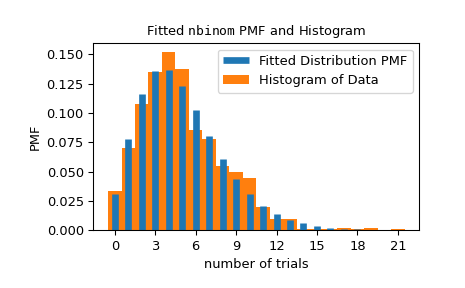
“hist”:將擬合分佈的 PDF/PMF 疊加在資料的標準化直方圖之上。
“qq”:理論分位數與經驗分位數的散佈圖。具體來說,x 坐標是在百分位數
(np.arange(1, n) - 0.5)/n處評估的擬合分佈 PPF 值,其中n是資料點的數量,而 y 坐標是排序後的資料點。“pp”:理論百分位數與觀察到的百分位數的散佈圖。具體來說,x 坐標是百分位數
(np.arange(1, n) - 0.5)/n,其中n是資料點的數量,而 y 坐標是在排序後的資料點處評估的擬合分佈 CDF 值。“cdf”:將擬合分佈的 CDF 疊加在經驗 CDF 之上。具體來說,經驗 CDF 的 x 坐標是排序後的資料點,而 y 坐標是百分位數
(np.arange(1, n) - 0.5)/n,其中n是資料點的數量。
- ax
- 回傳值:
- ax
matplotlib.axes.Axes 繪製圖表的 matplotlib Axes 物件。
- ax
範例
>>> import numpy as np
>>> from scipy import stats
>>> import matplotlib.pyplot as plt  # matplotlib must be installed
>>> rng = np.random.default_rng()
>>> data = stats.nbinom(5, 0.5).rvs(size=1000, random_state=rng)
>>> bounds = [(0, 30), (0, 1)]
>>> res = stats.fit(stats.nbinom, data, bounds)
>>> ax = res.plot()  # save matplotlib Axes object
可以使用
matplotlib.axes.Axes物件來自訂圖表。詳情請參閱matplotlib.axes.Axes文件。>>> ax.set_xlabel('number of trials') # customize axis label >>> ax.get_children()[0].set_linewidth(5) # customize line widths >>> ax.legend() >>> plt.show()