多尺度圖相關性 (MGC)#
透過 scipy.stats.multiscale_graphcorr,我們可以測試高維度和非線性資料的獨立性。在開始之前,讓我們先匯入一些有用的套件
>>> import numpy as np
>>> import matplotlib.pyplot as plt; plt.style.use('classic')
>>> from scipy.stats import multiscale_graphcorr
讓我們使用自訂繪圖函數來繪製資料關係
>>> def mgc_plot(x, y, sim_name, mgc_dict=None, only_viz=False,
...              only_mgc=False):
...     """Plot sim and MGC-plot"""
...     if not only_mgc:
...         # simulation
...         plt.figure(figsize=(8, 8))
...         ax = plt.gca()
...         ax.set_title(sim_name + " Simulation", fontsize=20)
...         ax.scatter(x, y)
...         ax.set_xlabel('X', fontsize=15)
...         ax.set_ylabel('Y', fontsize=15)
...         ax.axis('equal')
...         ax.tick_params(axis="x", labelsize=15)
...         ax.tick_params(axis="y", labelsize=15)
...         plt.show()
...     if not only_viz:
...         # local correlation map
...         plt.figure(figsize=(8,8))
...         ax = plt.gca()
...         mgc_map = mgc_dict["mgc_map"]
...         # draw heatmap
...         ax.set_title("Local Correlation Map", fontsize=20)
...         im = ax.imshow(mgc_map, cmap='YlGnBu')
...         # colorbar
...         cbar = ax.figure.colorbar(im, ax=ax)
...         cbar.ax.set_ylabel("", rotation=-90, va="bottom")
...         ax.invert_yaxis()
...         # Turn spines off and create white grid.
...         for edge, spine in ax.spines.items():
...             spine.set_visible(False)
...         # optimal scale
...         opt_scale = mgc_dict["opt_scale"]
...         ax.scatter(opt_scale[0], opt_scale[1],
...                    marker='X', s=200, color='red')
...         # other formatting
...         ax.tick_params(bottom="off", left="off")
...         ax.set_xlabel('#Neighbors for X', fontsize=15)
...         ax.set_ylabel('#Neighbors for Y', fontsize=15)
...         ax.tick_params(axis="x", labelsize=15)
...         ax.tick_params(axis="y", labelsize=15)
...         ax.set_xlim(0, 100)
...         ax.set_ylim(0, 100)
...         plt.show()
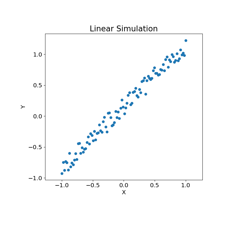
讓我們先看看一些線性資料
>>> rng = np.random.default_rng()
>>> x = np.linspace(-1, 1, num=100)
>>> y = x + 0.3 * rng.random(x.size)
模擬關係可以繪製如下
>>> mgc_plot(x, y, "Linear", only_viz=True)
現在,我們可以看見檢定統計量、p 值和 MGC 地圖視覺化如下。最佳尺度在圖上以紅色 “x” 顯示
>>> stat, pvalue, mgc_dict = multiscale_graphcorr(x, y)
>>> print("MGC test statistic: ", round(stat, 1))
MGC test statistic:  1.0
>>> print("P-value: ", round(pvalue, 1))
P-value:  0.0
>>> mgc_plot(x, y, "Linear", mgc_dict, only_mgc=True)
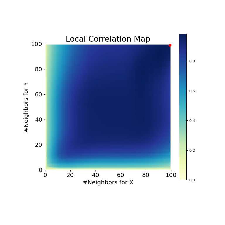
從這裡可以清楚看出,MGC 能夠判斷輸入資料矩陣之間的關係,因為 p 值非常低且 MGC 檢定統計量相對較高。MGC 地圖顯示強線性關係。直觀上,這是因為擁有更多鄰居將有助於識別 \(x\) 和 \(y\) 之間的線性關係。在這種情況下,最佳尺度相當於全域尺度,在地圖上以紅點標記。
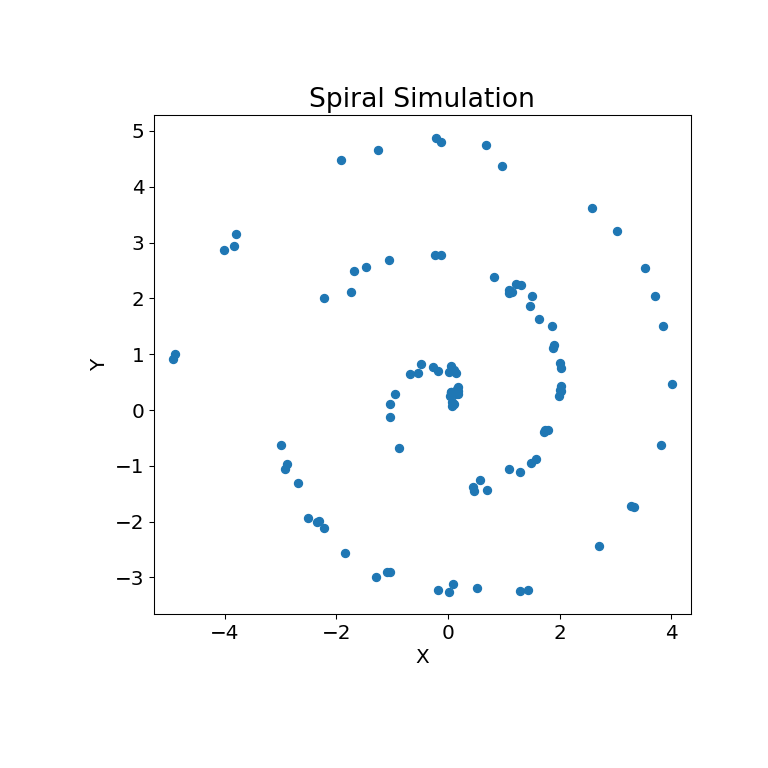
非線性資料集也可以做同樣的事情。以下 \(x\) 和 \(y\) 陣列是從非線性模擬衍生而來
>>> unif = np.array(rng.uniform(0, 5, size=100))
>>> x = unif * np.cos(np.pi * unif)
>>> y = unif * np.sin(np.pi * unif) + 0.4 * rng.random(x.size)
模擬關係可以繪製如下
>>> mgc_plot(x, y, "Spiral", only_viz=True)
現在,我們可以看見檢定統計量、p 值和 MGC 地圖視覺化如下。最佳尺度在圖上以紅色 “x” 顯示
>>> stat, pvalue, mgc_dict = multiscale_graphcorr(x, y)
>>> print("MGC test statistic: ", round(stat, 1))
MGC test statistic:  0.2  # random
>>> print("P-value: ", round(pvalue, 1))
P-value:  0.0
>>> mgc_plot(x, y, "Spiral", mgc_dict, only_mgc=True)
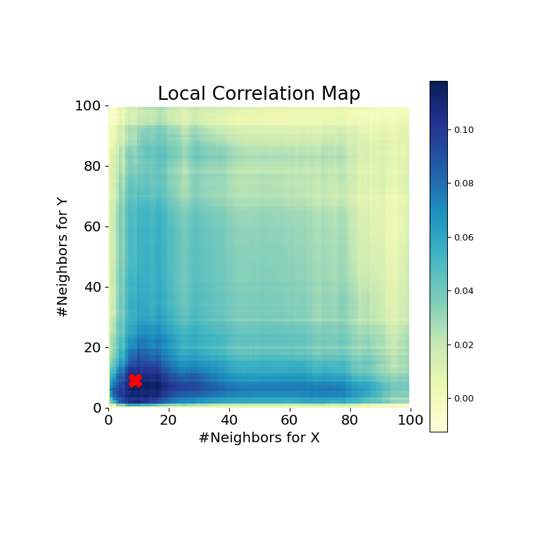
從這裡可以清楚看出,MGC 再次能夠判斷關係,因為 p 值非常低且 MGC 檢定統計量相對較高。MGC 地圖顯示強非線性關係。在這種情況下,最佳尺度相當於局部尺度,在地圖上以紅點標記。